
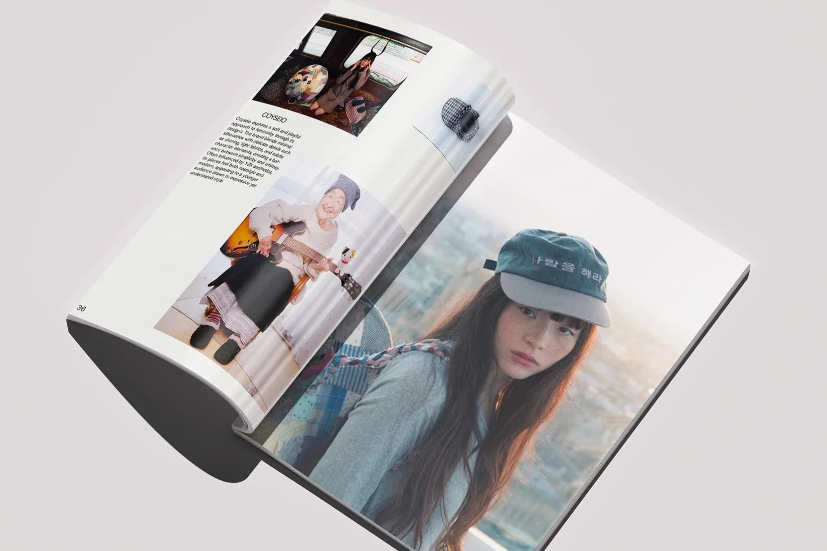
AMODA
AMODA is an editorial magazine that explores fashion through identity, emotion and culture rather than just appearance. The project was created from my interest in editorial design and my desire to create a print experience that feels more human-centered and relatable to younger audiences. Inspired by online culture, personal interests and experimental fashion publications, AMODA became a space where I could explore ideas through writing, typography and visual storytelling. Instead of focusing only on luxury fashion or polished aesthetics, the magazine approaches fashion from a more emotional and psychological perspective, showing how personal style can reflect individuality and self-expression.
Project: Magazine
Designer: Estefania Aguilar
Tools: Illustrator, Indesign, Photoshop
Challenge
The challenge of this project was to create a magazine that felt visually experimental while still maintaining structure and readability. I wanted the publication to feel engaging enough to pull people away from their phones and reconnect them with print media. At the same time, I wanted to avoid creating something that felt overly corporate, polished or emotionally empty. The goal was to design a magazine that felt expressive, human and visually memorable while still communicating clearly.
Concept
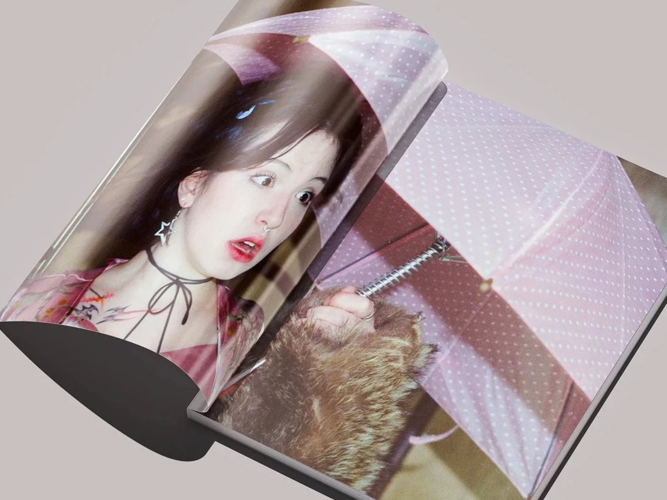
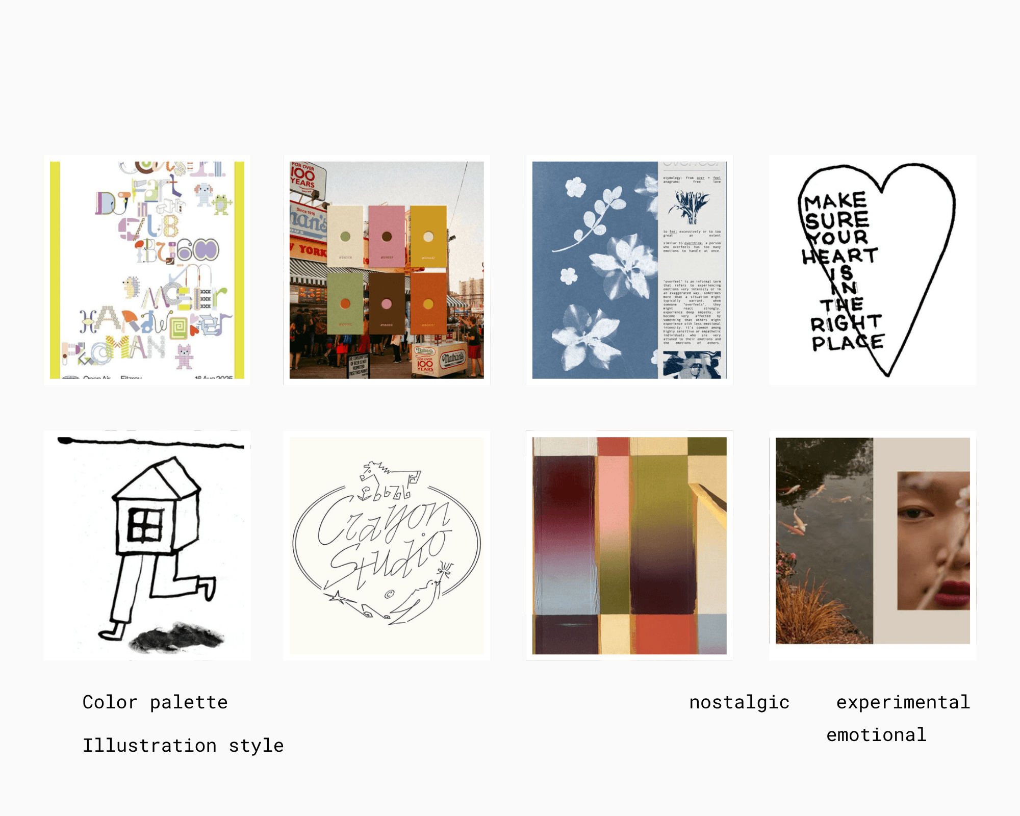
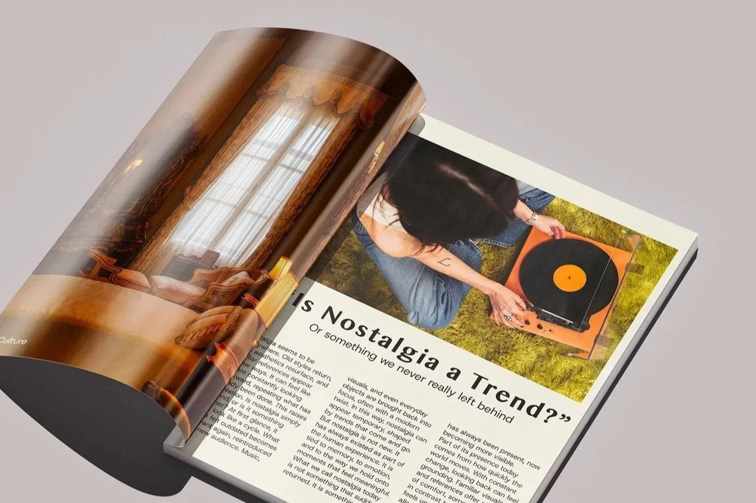
The creative direction of AMODA was shaped by ideas of nostalgia, emotion and experimentation. I wanted the magazine to feel slightly chaotic and rule-breaking while still being thoughtfully curated. Much of the inspiration came from my own experience exploring editorial magazines from different countries and noticing how many fashion publications focus heavily on luxury and advertisement-driven visuals. I wanted AMODA to feel more personal and emotionally connected to its audience.
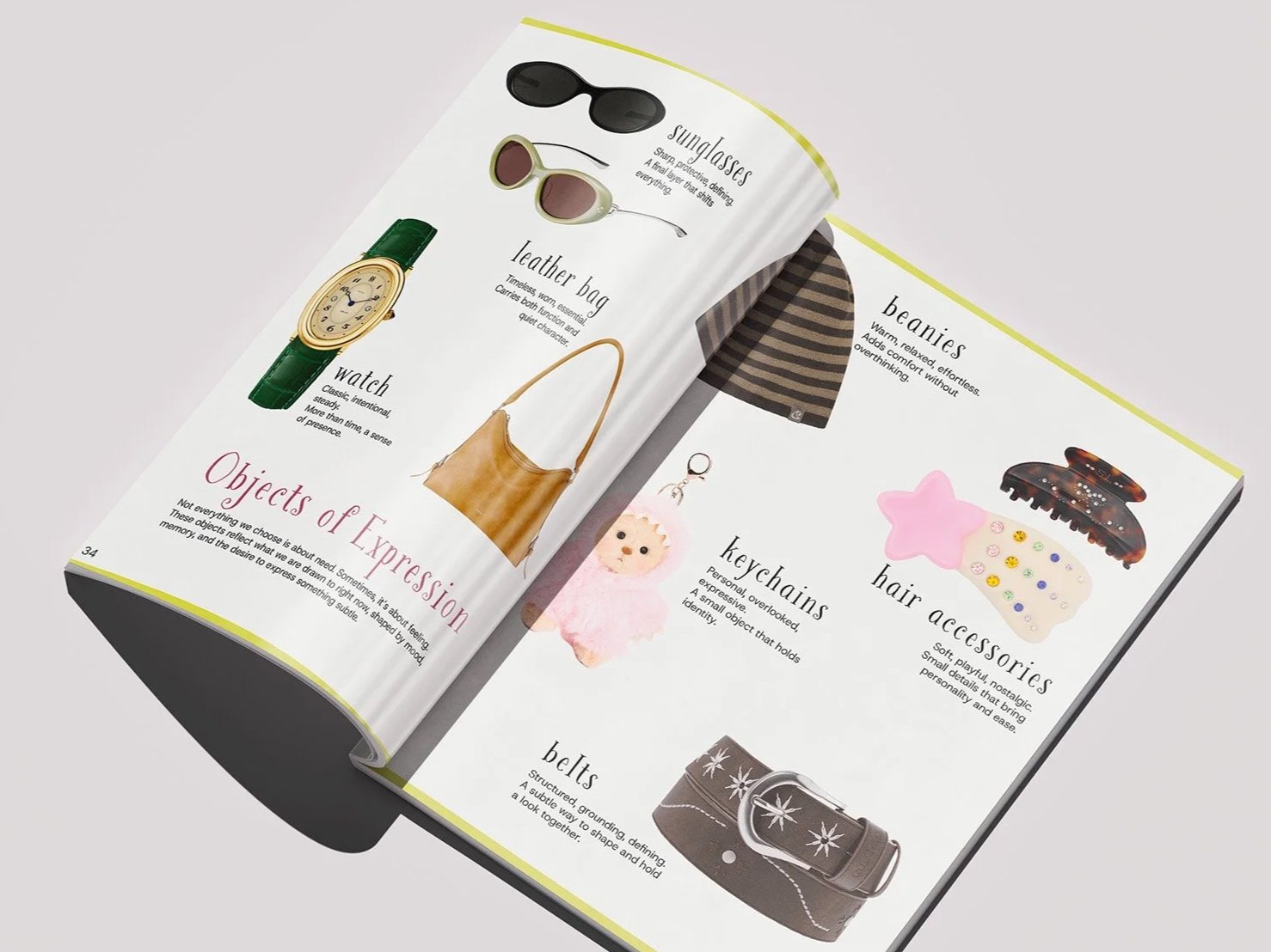
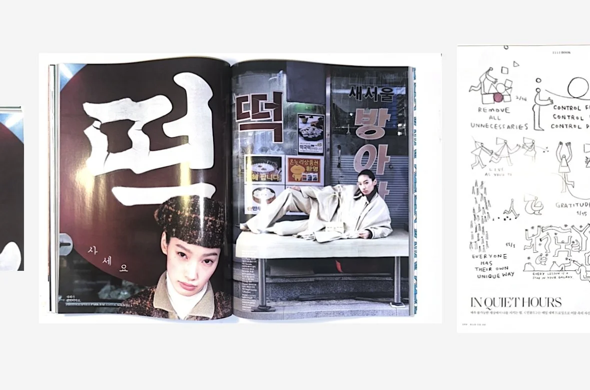
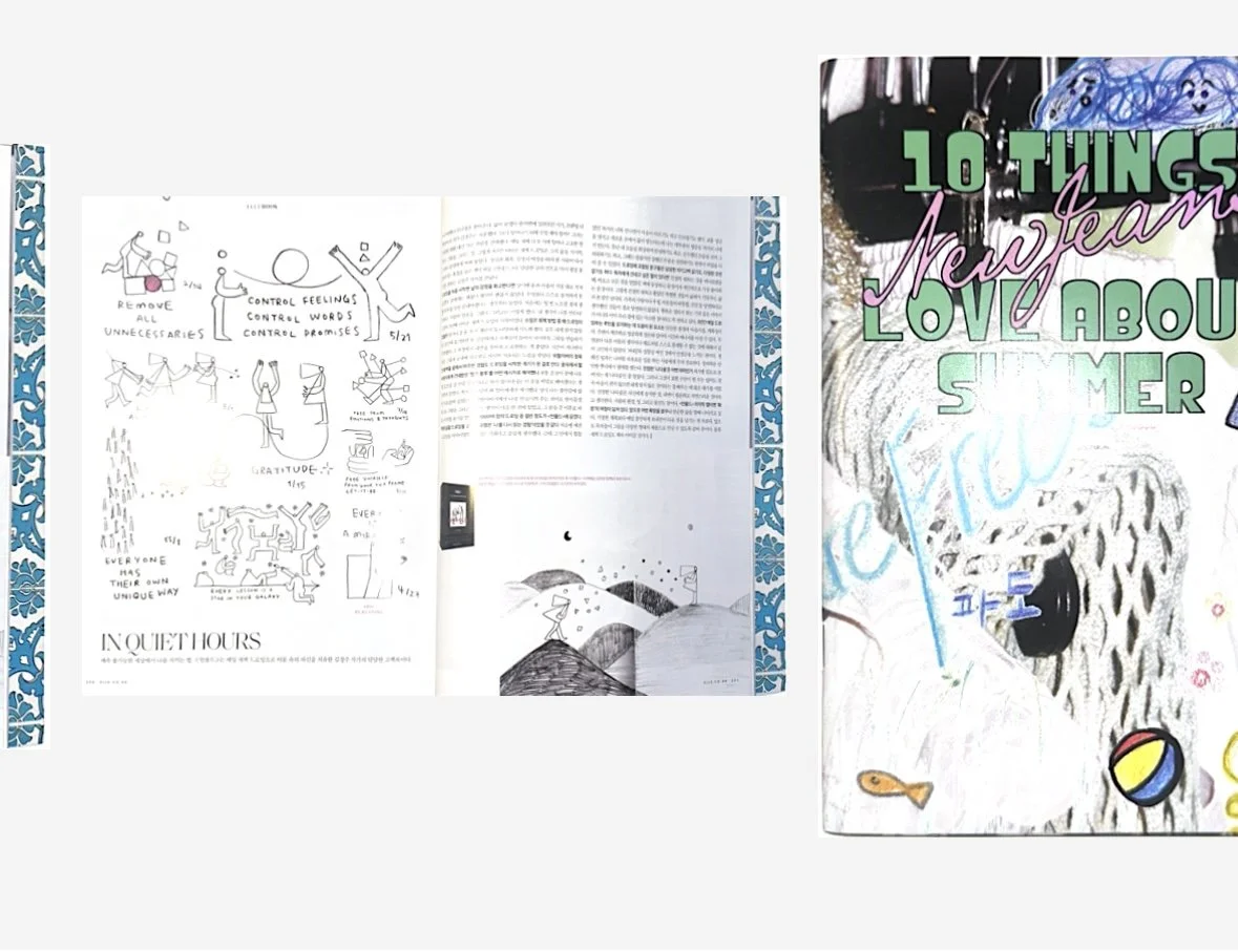
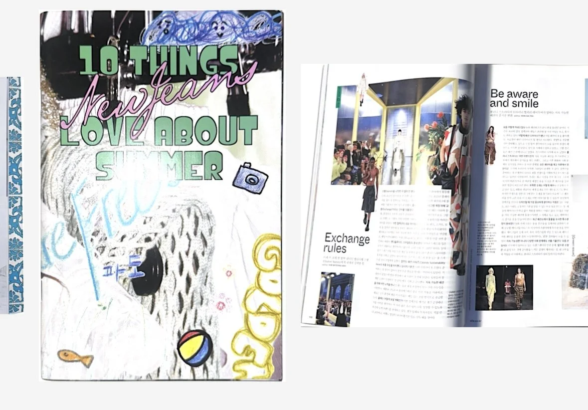
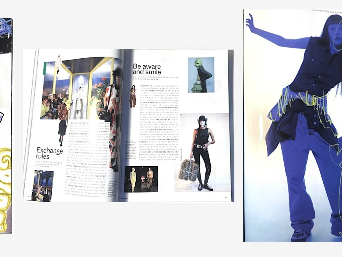
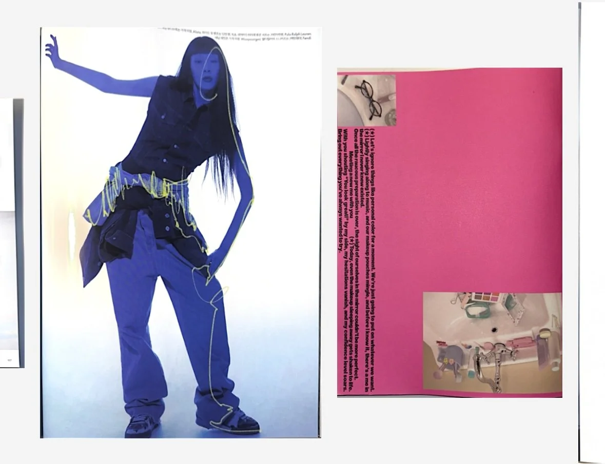
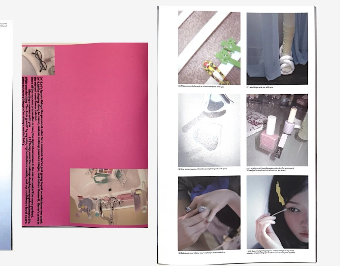
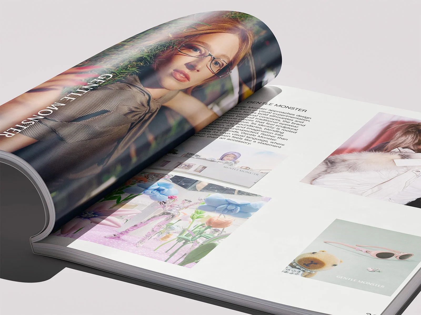
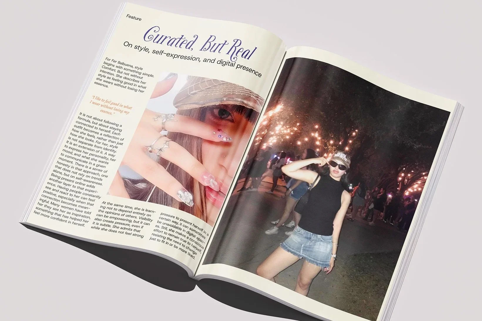
The magazine combines expressive typography, bold color palettes, imperfect layouts and playful illustrations to create a visual language that feels youthful and alive. Rather than following traditional editorial rules perfectly, I intentionally allowed certain layouts to break the grid and feel more spontaneous. This approach helped reinforce the personality of the magazine while keeping the experience visually engaging.
Research
While researching editorial magazines, I noticed many fashion publications focused heavily on luxury branding, polished visuals and advertisement-driven content. Although visually appealing, many of them felt emotionally distant from younger audiences. This inspired me to explore a more human-centered approach that focused on identity, emotion and online culture rather than perfection.
Process

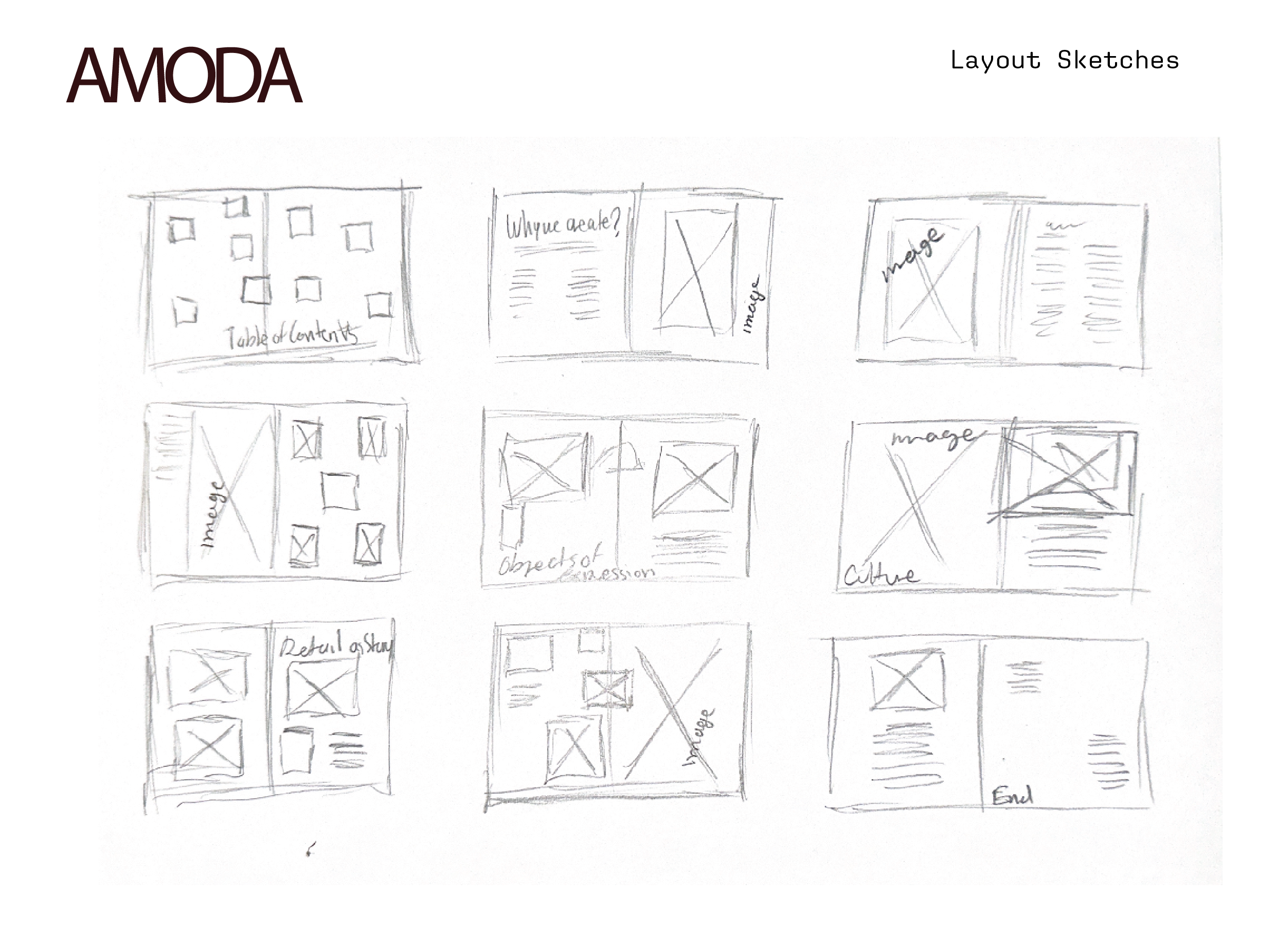
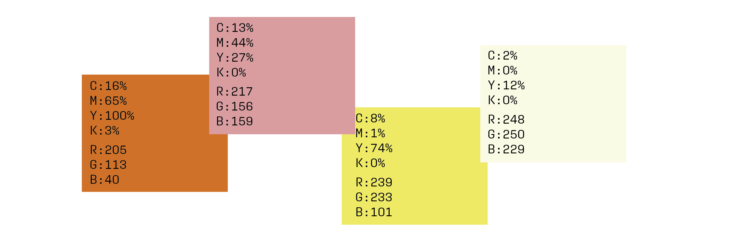
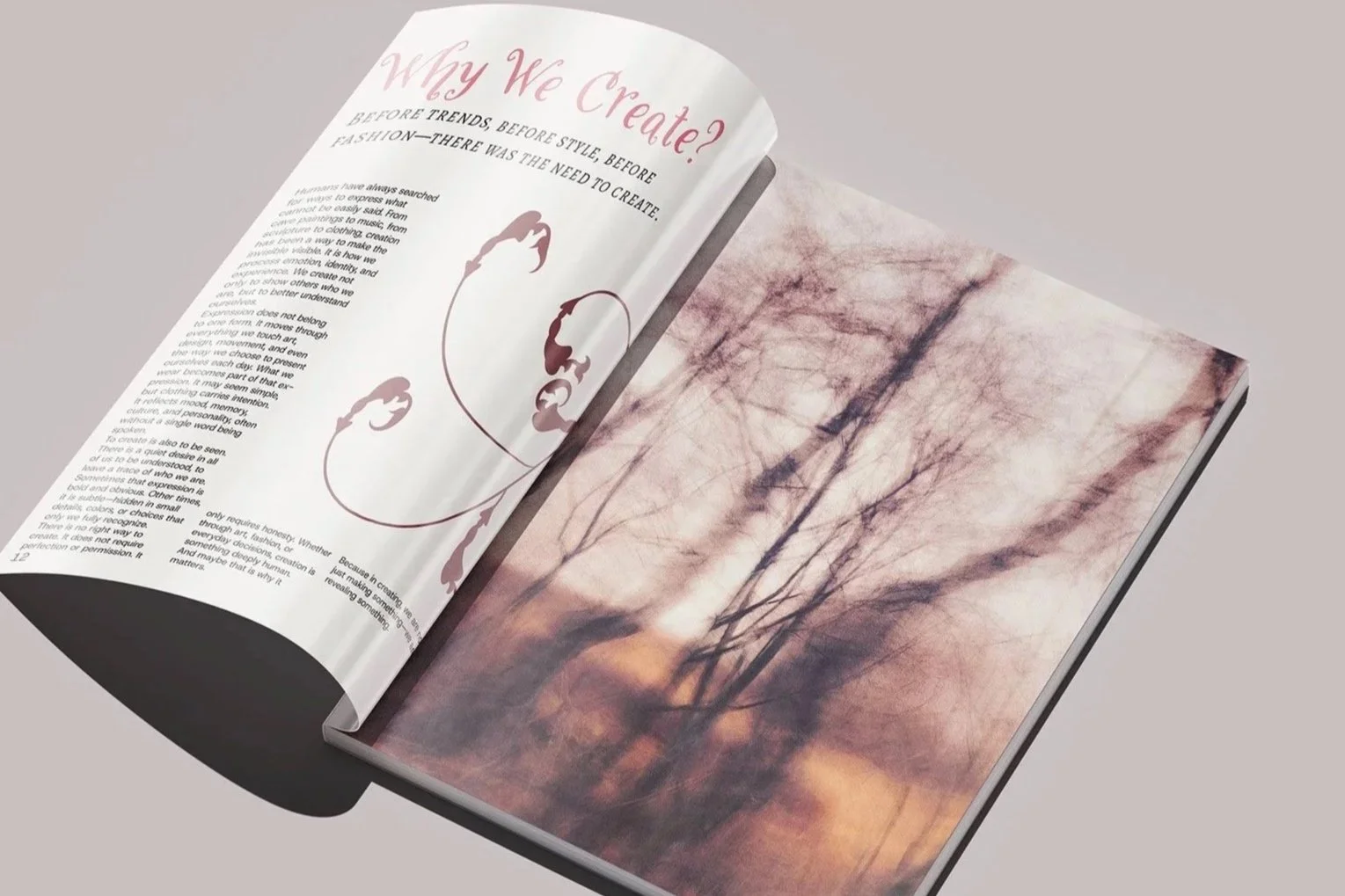
Typography played a major role in shaping the personality of AMODA. I explored childlike and handwritten type styles to create a sense of nostalgia and playfulness that matched the tone of the magazine. The visual system combines bold colors, large areas of whitespace and expressive layouts to create contrast and avoid overwhelming the reader.
I also created custom illustrations throughout the magazine to support the playful and emotional atmosphere of the project. While the layouts can appear experimental and imperfect at times, every visual decision was intentionally designed to support the overall concept and maintain cohesion across the publication.
OUTCOME
AMODA helped me explore editorial design in a more personal and experimental way. Through this project, I learned how design can feel emotional, imperfect and expressive while still communicating effectively. It also pushed me to trust my own visual instincts and create something that reflects both my interests and the way I experience online and fashion culture. More than creating a magazine about fashion, I wanted to create an experience that leaves readers curious, emotionally connected and wanting to continue exploring.